How To Select Fonts For The Website?
Select your brand positioning, and that’s how you will be able to select the right fonts and eliminate the rest.

Nothing is less or more important when you are creating a beautiful website; every small detail needs attention.
However, a few essential parts of the creation get overlooked, for example - the fonts or typeface.
Have you noticed how little or no attention you give to typeface or fonts when you check the website for the first time? As a developer, your objective will be to observe how fast and easily accessible it is. As a user, you will automatically be impressed by how fast it is, how easy it is to use, how beautiful it looks, etc., but not directly with the fonts.
Ideally, that’s how it should be. Fonts or typefaces are meant to be overlooked. The main function of any text that is present on the website is to be read. The fonts or typeface make it less or more readable, but the ideal one makes it a less important element to notice.
But when you are the creator of the website, it becomes extremely difficult to select the fonts that are set right with the brand voice, objective, and how users use your website.
Before jumping into any more discussion, let’s first understand the difference between fonts and typeface.
Fonts Vs Typeface
A lot of us use fonts and typefaces as interchangeable terms which is technically not right.
This primarily happened because of Steve Jobs. He decided to call typeface “fonts” when his team decided to introduce typography on the computer.
As a designer or an aspiring one, this difference is one of the things that you learn in the early days but if you are not, then it becomes a mystery for you.
Let me give you a simple example that will clear all the doubts - “Lora” is a typeface whereas “Lora Semi Bold 12px” is a font.
I hope this clears up what exactly is typeface and what is font. If not, then go to Google Docs, and hover over the font section, the main list is a typeface and the sub-options of the main list are fonts.
Now you know the difference, let’s move to understand the basics of typefaces and fonts.
Basics of typefaces and fonts
To browse fonts effectively, you should be familiar with basic terminology. This is what we will learn in this section.
We will talk about the main 5 categories -
Serif fonts -
These fonts have small lines or strokes at the ends of letters and are used in printed materials such as books, newspapers, and magazines. Serif fonts are old-looking ones, more traditional and formal in style.
These help people read long texts by making it easier to tell similar letters apart, and they also help guide the reader's eyes from one word to the next.
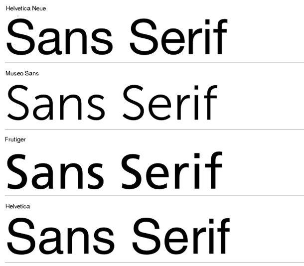
Sans-serif fonts -
These fonts are the exact opposite of serif fonts. They use simple geometric lines to create letters. The font is sleek and contemporary, fitting in with the rest of the design without sacrificing readability.
These are used in digital media, such as websites and mobile applications.
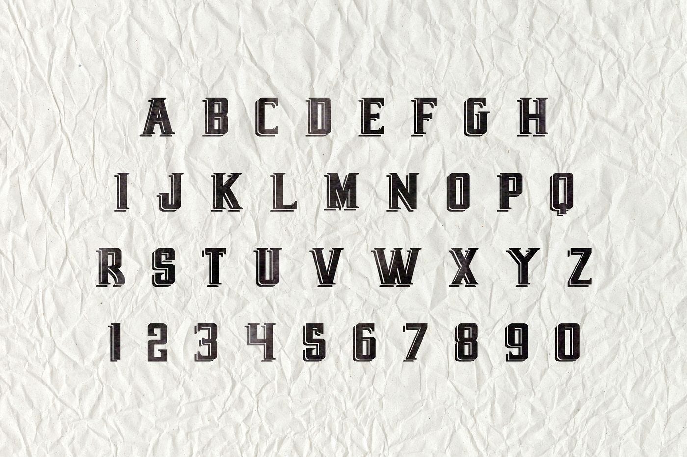
Display fonts -
These types of fonts are created to be used in bigger sizes, for things like titles, headlines, and logos. They usually have their special look and can help create a certain tone or identity for a brand or project.
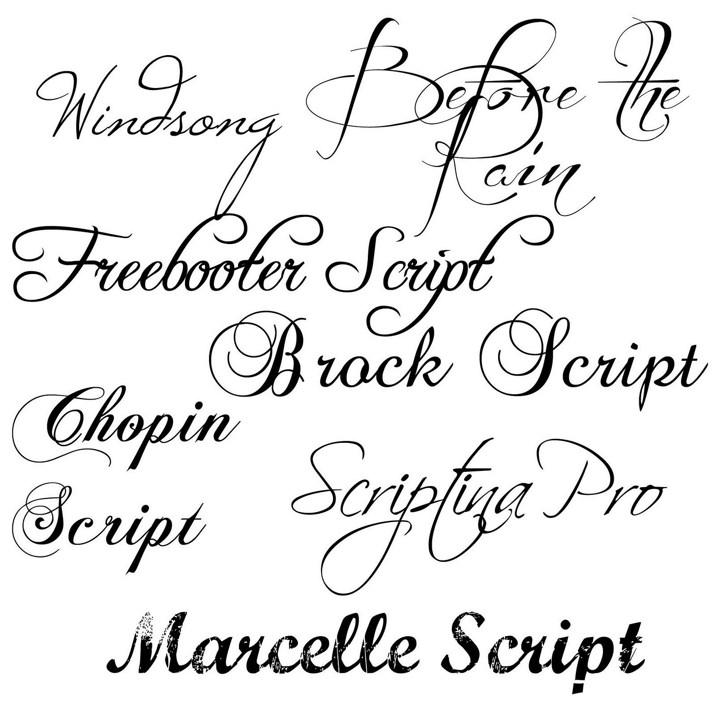
Script fonts -
Some fonts are not meant to be readable, and that’s what script fonts represent. These fonts copy the look of someone's handwriting or artistic writing. These are commonly used for fancy events like formal invitations or in other sophisticated designs.
Monospaced fonts -
These types of fonts have the same width for every letter and are commonly used in computer programming, as they help to arrange code and text more easily.
While selecting the fonts, you should know the basic terminology to categorize them. Now, you can easily understand which font you can use according to your use case.
Let’s understand the factors you should consider while selecting the fonts.
Factors to keep in mind
Improve the user experience
The objective is to make the user experience more enjoyable. Reading should not feel like work. The ideal font should be -
Legible: Each letter of the alphabet has a specific structure and shape that distinguishes it from the rest of the alphabet.
Tip - Do the Il1 test, “I” capital of “i”, “l” lowercase of “L”, and 1 look similar for some fonts. The selected font should be able to differentiate between them.
Readable: While selecting the best font for your project, think about letter spacing, line height, text size, and text color. A general rule of thumb is that your font size shouldn’t be less than 12px.
Tip - See if you want to descend the numbers or not; some fonts descend the numbers, which affects the readability of the text if your text is full of numbers.
Versatile: The selected font should be easily readable on every screen. Test how your selected fonts look when view put them in bold, italic, and regular, and how it affects the readability and legibility when changing the size.
Appropriate: Imagine using “comic sans” for a funeral invite and “times new roman" for a Halloween party invite. Yes, it won't look appropriate. Before selecting, think about the image and value you want to communicate.
Communicate your brand identity
What kind of feeling you want to create matters here. How do you want to position your brand? Comfortable? Reliable? Traditional? Modern? Minimalistic? Strong and stable? Elegant or beautiful?
Select your positioning, and that’s how you will be able to select the right fonts and eliminate the rest.
Create the right emotions
What kind of emotions do you want to convey? Simple fonts are easily readable and make the experience better. On the other hand, fancy fonts represent superiority and are associated with high quality.
Understand what your objective is. If you want the visitor to complete a certain task, then the simple font is the best choice.
Load in every browser
Here comes the font fallback part; sometimes your font doesn’t get rendered on the user browser, and that’s when it’s recommended to use a regular font which is stored on every device as a fall-back font.
How much text do you use?
That tells if it should be sans, sans-serif, display, etc. If it’s a long text, sans-serif looks decent. If your primary target is shorter text, aesthetics should guide your choice.
How do users use your website?
If a user is going to spend hours on the website, then your primary selection should be dependent on the ease of use.
Remember to consider the user’s perspective before selecting the font.
At the end of the day, the selection of fonts will get easier with time and practice. Making side projects don’t only help in building a portfolio but also in getting better at these essential tasks that are mostly overlooked.
Here are some websites which you can use to select the fonts!
Google Fonts
Adobe Fonts
Wordmark
Open Foundry -
The League of Moveable Types -
Fontjoy -
Fontjoy - Generate font pairings in one click
Font Fabric -
Font Squirrel -
Free Fonts! Legit Free & Quality » Font Squirrel
Font Spring -
Fontspring. Worry-Free fonts for everyone.
Abstract Fonts -
Fonts In Use -
Fonts In Use – Type at work in the real world.
NeoGrey -
What technique or strategy do you use while selecting fonts? Share with us on Peerlist Scroll!


